
22 Small Living Room Ideas for Couples in Their First Apartment
This platform is proudly ad-free! To keep it that way and support our efforts, some posts may contain affiliate links. These links come at no extra cost to you, but they help us grow and continue providing valuable content. Thank you for your understanding and support!
Small living rooms demand intentional choices, but couples moving into their first apartment rarely have the budget for renovation. Your space needs to feel like home for two people with different styles.
The right small living room ideas balance functionality with atmosphere without requiring major construction. Most of these approaches cost under $200 total and use furniture and textiles you can rearrange or replace later without guilt.
This list focuses on layouts, colour treatments, and storage solutions that actually work in tight square footage. You’ll find low-profile furniture strategies, mirror tricks, and lighting fixes that make rooms feel bigger and more inviting than they are.
1. Low-Profile Sectional Setup
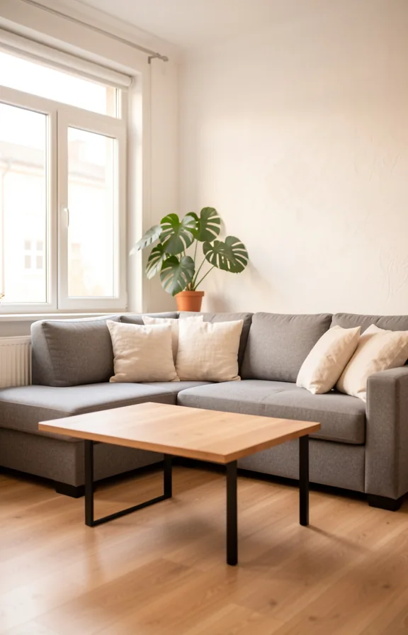
A low-slung sectional anchors the room without eating up visual space. Soft grey or cream upholstery keeps the palette calm and expansive, even in tight quarters.
Pair it with a natural wood coffee table on black metal legs. This combination grounds the seating while maintaining clean sight lines across the room.
Layered throws in linen or cotton add texture without bulk. One sage green or warm taupe throw draped over the arm breaks the neutral base.
Lighting matters here. A tall arc lamp behind the sectional or a pair of low brass table lamps on side tables creates depth and warmth.
This works best in rooms where you can pull the sectional slightly away from the wall. That floating arrangement makes even small spaces feel intentional and layered.
Pro Tip: Choose a sectional with low arms and exposed legs rather than a skirt or storage base. This silhouette reads as open and allows light to travel underneath.
2. Floating Shelves Display Wall
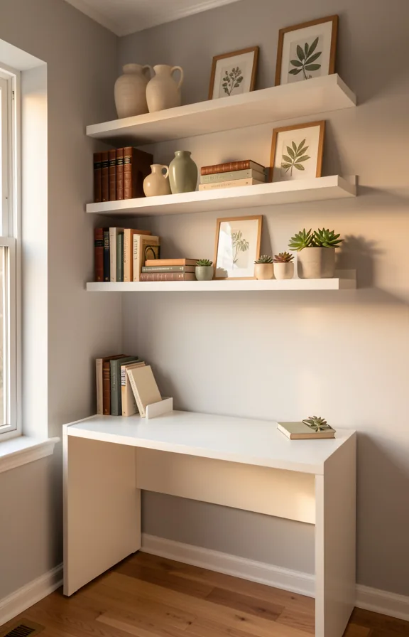
White painted floating shelves arranged vertically down one accent wall create depth without stealing floor space. The shelves hold a mix of books, potted plants, and small ceramics in neutral cream and soft green tones.
Soft warm lighting from a desk lamp below casts gentle shadows that make the wall feel dimensional and lived-in. The neutral palette keeps the eye moving across the whole wall rather than stopping on clutter.
This works well in first apartments because it solves storage and decoration in one move. You gain functional shelving while the wall becomes your room’s visual anchor.
Most people hang shelves too high, which makes the room feel disconnected. Mount them at eye level or just below for better proportion and visual impact.
Pro Tip: Space shelves 12 to 14 inches apart vertically. This creates breathing room between levels and prevents the wall from looking cramped or overwhelming.
3. Neutral Layered Textiles
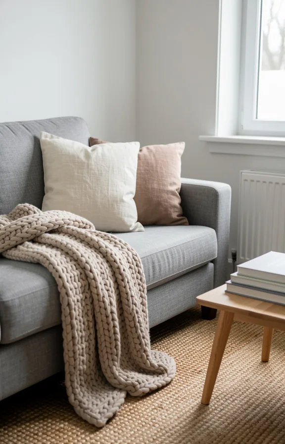
Cream linen throws drape over a warm grey sofa, anchored by natural jute and chunky knit pillows in oatmeal tones. A soft wool area rug in pale taupe grounds the seating, while linen curtains diffuse natural light into the room without blocking it.
This palette works because neutral textiles hide dust and stains better than bold fabrics. They also feel calm after a long workday, which matters in a shared first apartment.
The layering creates depth and texture without adding visual clutter to a tight footprint. Each fabric has a different weave—smooth linen, chunky knit, flat jute—so the eye travels across the sofa and stays interested.
The room breathes. There’s no pattern competition, no colour shock, just a quiet backdrop for the two of you to actually live in your space.
Pro Tip: Choose textiles in different weights and weaves rather than matching patterns. A chunky knit pillow next to a smooth linen throw reads richer than two items in the same fabric.
4. Corner Reading Nook
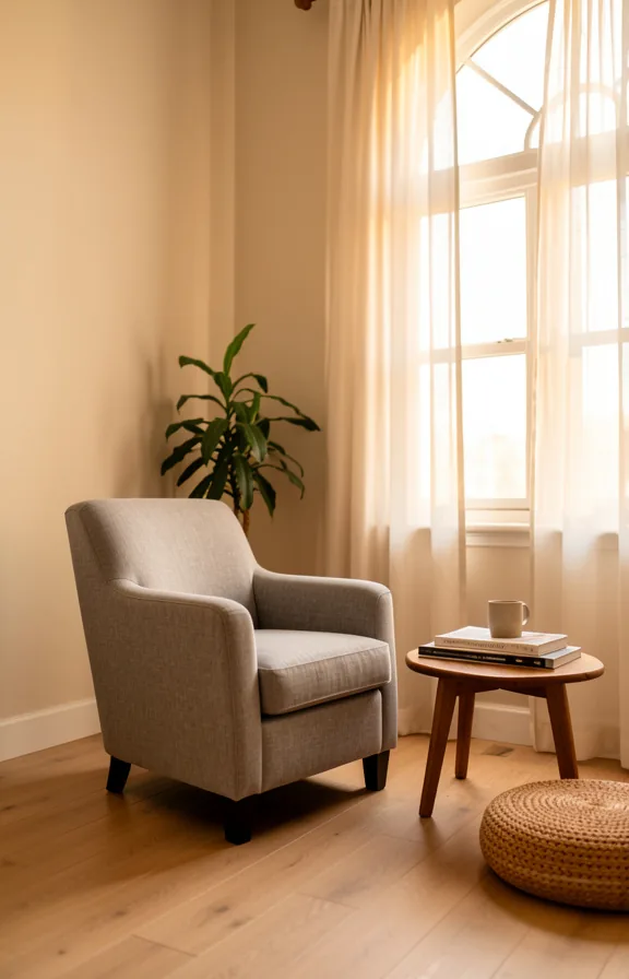
A low wooden chair tucked into your room’s furthest corner becomes an instant refuge. Warm cream or soft grey walls anchor the space, while a single brass floor lamp casts amber light downward at night.
Layer in a chunky knit throw in natural linen or wool, and a small side table holds your current read and a mug. The tight square footage actually works in your favour here. The corner’s natural walls create immediate coziness.
This works well because the nook doesn’t demand square footage from your main living area. It uses dead corner space that your sofa can’t occupy anyway.
Soft materials matter more than size. A natural wood frame, linen cushion, and wool blanket read as intentional without needing much room.
Pro Tip: Place your lamp on the floor or a very low table, not at typical eye level. Warm light below sitting height makes small rooms feel more intimate and grounded.
5. Mirrored Accent Wall
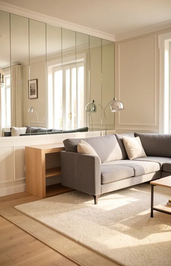
Reflective surfaces bounce light around a compact room and push the walls back visually. A mirrored accent wall behind your sofa or opposite a window multiplies natural brightness throughout the day.
The wall catches and redistributes every light source in the room. This creates depth that small spaces desperately need without taking up floor space.
Keep the rest of your palette neutral so the mirrors become the feature, not the backdrop. Soft grays, warm whites, and natural wood furniture let the reflective surface do the work.
The effect is clean and modern without feeling cold or clinical. Evening light reflects off the mirrors and creates a quieter, more intimate atmosphere once the sun sets.
This approach works best in rooms where you can avoid direct reflections of clutter or your TV screen. Most couples find the visual expansion worth the small consideration around placement.
Pro Tip: Use mirror tiles or sheets rather than individual framed mirrors. Seams disappear when installed flush, and the effect feels intentional rather than pieced together.
6. Warm Pendant Light Trio
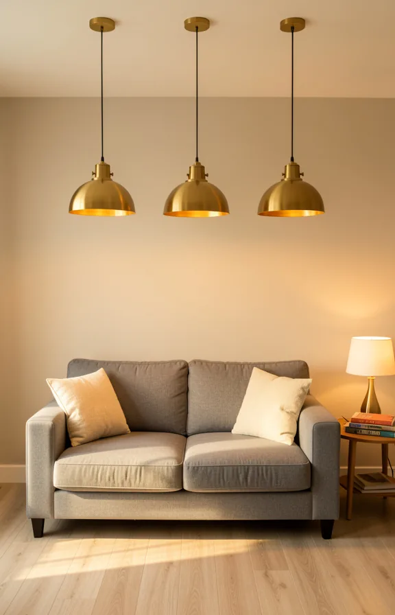
Warm amber tones pool downward from three brass pendant fixtures suspended at varying heights above your seating area. The light hits cream linen upholstery and reflects softly across honey-toned wood floors below.
This layered lighting approach makes a compact room feel intentional rather than cramped. The pendants create visual interest overhead while keeping the floor plan completely open underneath.
Brass or brushed gold finishes pair naturally with warm whites, natural linens, and light wood surfaces. The glow mimics early evening light, which feels intimate without being dim or cave-like.
This concept works best in rooms where you can mount fixtures on the ceiling or existing light box without additional wiring. Most of the effect comes from the quality and placement of light itself, not the furniture below it.
Pro Tip: Hang pendants lower than you think necessary. Dropping them closer to eye level when seated makes the room feel warmer and more connected to your seating area.
7. Two-Tone Paint Division
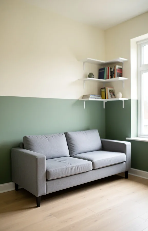
Soft cream meets sage green at chair rail height, creating a natural visual split. The lighter upper half keeps the space feeling open and airy overhead.
This horizontal line grounds the room without eating square footage. Your eye reads the division as intentional, not a constraint.
The lower tone anchors darker furniture and textiles while the upper half reflects light. Matte finishes on both colors prevent the division from feeling too rigid or glossy.
The concept works best in rooms with one focal wall. Paint the wall behind your sofa or media console, leaving adjacent walls neutral.
Pro Tip: Use painter’s tape at exactly 4 feet high for a clean line that feels architectural rather than accidental.
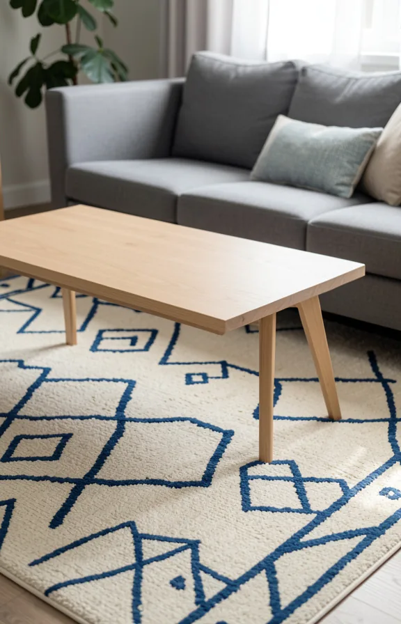
8. Compact Coffee Table Styling
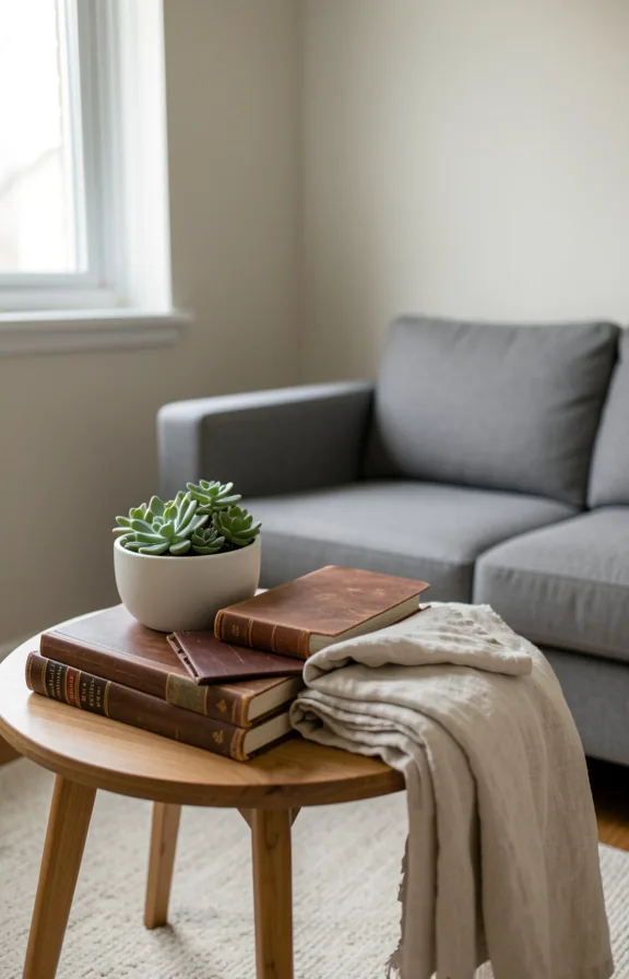
A low wooden table becomes the anchor in a tight living room when styled with intention. Stack leather-bound books in warm browns and blacks, then top with a single ceramic vessel or a small potted plant.
The table itself should sit 16 to 18 inches tall, leaving clear sight lines across the room. Natural wood tones (walnut, oak, or reclaimed pine) pair well with neutral textiles and muted wall colours.
Keep surfaces mostly open. Two or three carefully chosen objects read better than a crowded display in small spaces.
This works best when your coffee table doubles as both function and visual relief. Most of the impact comes from restraint, not from filling every inch.
Pro Tip: Round or oval tables feel less bulky in tight spaces than rectangular ones, and they let you move around the room more freely.
9. Woven Storage Baskets
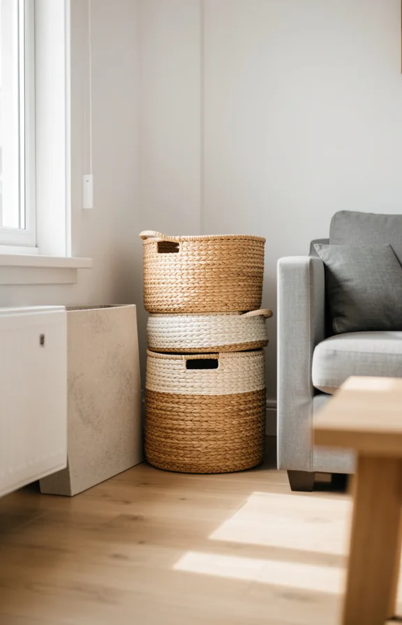
Natural woven baskets in varying heights sit low beside your sofa and under side tables. Their warm tan and cream tones ground the room without taking up floor space.
The texture of jute, rattan, or seagrass creates visual interest against softer furniture and painted walls. This contrast keeps a small room from feeling flat or sterile.
Baskets hold everything from blankets to remote controls to your partner’s books. They hide clutter without announcing that storage is happening.
This approach works well in compact layouts because it keeps storage vertical and contained. Most couples find baskets feel less corporate than closed shelving units.
The warm neutrals pair easily with any colour scheme you add later. You can swap basket styles as your taste evolves without redecorating.
Pro Tip: Keep baskets open on top so you actually use them. Lids create friction and clutter piles onto them instead.
10. Sliding Barn Door Closet
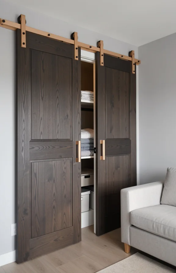
A sliding barn door replaces swing-out closet doors and saves you precious floor space in a tight room.
The door glides on a black metal track mounted above the opening, revealing storage without eating into the living area.
Choose natural wood in honey or weathered grey tones, or paint it to match your walls for a minimal look.
The hardware stays visible and becomes a design detail itself, adding rural character without taking up room.
Soft white or warm grey walls around the door let the wood finish breathe and keep the space feeling open.
This works best in homes with a standard closet opening and solid wall space to mount the track securely.
Pro Tip: Keep the track and hardware matte black or oil-rubbed bronze, not shiny, to blend into the architecture rather than catch the eye.
11. String Light Canopy
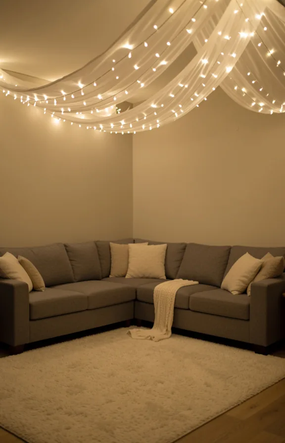
Warm white string lights draped in soft swags across your ceiling create an intimate overhead layer without bulk or permanence.
The lights cast a gentle amber glow that makes a compact room feel cozy rather than cramped.
This approach works in any rental space because the lights attach to adhesive hooks and leave no damage when removed.
Pair the canopy with neutral furnishings like a grey sofa and cream textiles so the soft light becomes the room’s focal point.
The effect is strongest when lights are the only overhead source in the evening, dimming the rest of the room naturally.
Most couples find this creates the right balance between shared space and private atmosphere in a first apartment.
Pro Tip: Drape lights in loose, uneven waves rather than perfect geometric patterns for an authentic, relaxed feel.
12. Modular Furniture Layout
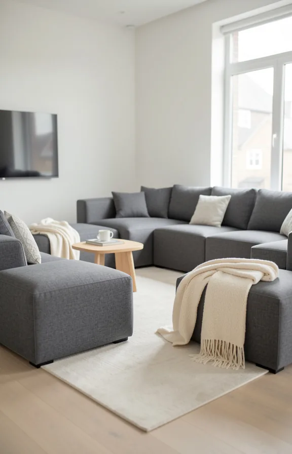
Pieces that move. Your sofa floats in the room instead of hugging the wall, creating actual zones without walls.
Low-profile seating in natural wood or light upholstery anchors the space without blocking sight lines. Small nesting tables, lightweight ottomans, and a console that doubles as a desk work around your actual layout, not against it.
The color story stays neutral: warm creams, soft greys, and undyed linen. Light floods in without anything blocking the eye from corner to corner.
This approach works best when you’re willing to experiment with placement over a few weeks. You’ll find what feels right, and you can adjust again when life changes.
Pro Tip: Choose furniture with visible legs instead of skirted bases. It makes even a packed room feel open and easier to clean underneath.
13. Potted Plant Corners
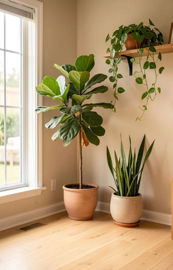
Rough terracotta against a white wall catches light differently than any painted surface can. A single tall plant in a corner draws your eye upward, making the ceiling feel higher than it is.
Group three pots of varying heights together, not scattered across shelves. Pair larger terracotta with smaller concrete planters for visual rhythm.
Position plants near a window or under a sheer curtain to cast moving shadows on the walls. This creates depth without taking up floor space.
The greenery softens hard edges and fills dead corners that would otherwise feel empty. Your eyes settle on the organic shapes instead of the room’s tight dimensions.
This works well in apartments with minimal wall art because living plants act as your main visual anchor. Most of this effect comes from placement and light quality, not from expensive plants.
Pro Tip: Keep pots the same material family (all terracotta, or all ceramic) so grouped corners read as intentional rather than random.
14. Patterned Area Rug
Geometric patterns in muted tones anchor a small living room without overwhelming it. A cream base with soft blue or grey geometric shapes creates visual interest while staying calm and grounded.
The rug defines your seating area and makes the space feel intentional. In a small room, pattern works harder than solid colour to add personality and depth.
Pair the rug with neutral walls and simple furniture to let the pattern breathe. This prevents the room from feeling visually crowded or chaotic.
Look for natural fibres like wool or jute blends. They wear better in high-traffic apartments and feel substantial underfoot.
Most couples find that patterned rugs hide dust and daily wear better than solids. This matters in a shared space where life actually happens.
Pro Tip: Choose a pattern scale that matches your room size. Small geometric repeats work better in tight spaces than large bold motifs.
15. Window Seat Bench
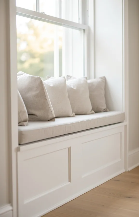
A low wooden bench built into your window frame becomes the room’s anchor point. White painted wood and a cushioned seat in natural linen create a calm, grounded feeling.
Soft light filters across the bench throughout the day, making it the best spot to read or sit quietly together. The bench uses dead space most apartments ignore and gains you real seating without a bulky sofa.
Throw pillows in cream and soft green add warmth without visual clutter. A simple linen runner protects the cushion and softens the wood’s hard edges.
This concept works in apartments with windows large enough to fit a 3- to 4-foot bench. Most of the impact comes from paint, cushion fabric, and pillow styling rather than structural work.
Pro Tip: Build the bench frame from affordable plywood and finish it with paint instead of stain. You’ll save money and get cleaner, brighter lines in a small room.
16. Metal and Wood Console
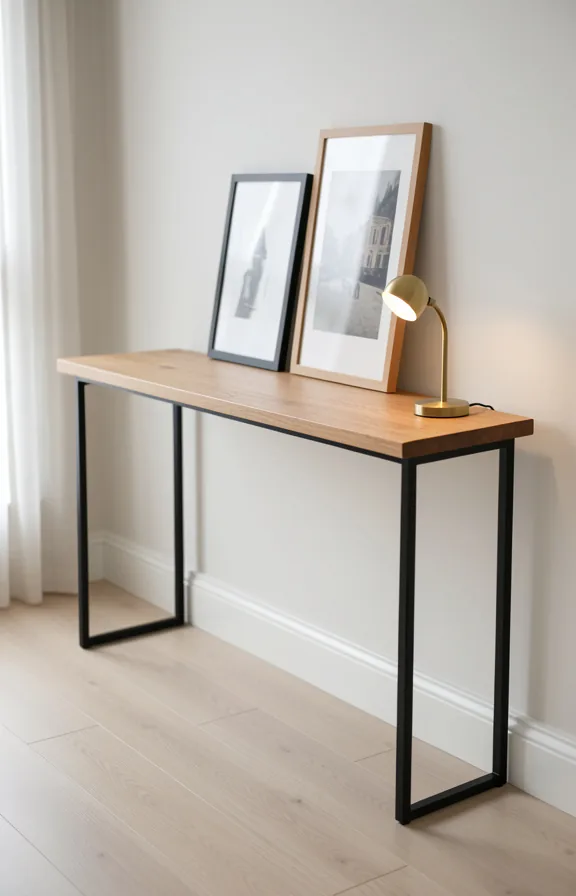
A natural wood top paired with a slim metal frame creates a console that anchors your entryway without feeling heavy. The contrast between warm timber and matte black steel gives the piece architectural weight despite its narrow footprint.
Your living room gains visual breathing room because you can see through the metal legs. This open base works especially well in small spaces where solid furniture blocks sight lines and makes rooms feel cramped.
The colour palette stays warm and earthy. Honey or walnut wood tones work against the dark metal frame, creating a modern-rustic balance that suits first apartments without looking temporary or sterile.
Use this console to display a single ceramic vase, a stack of art books, or a brass table lamp. Restraint here matters more than filling every inch of surface.
This concept works best in rooms with at least one wall you can anchor it to. Most of the effect comes from the contrast between materials, not from scale or styling.
Pro Tip: Choose a console depth of 30 to 35 centimetres or less. Shallower pieces read as furniture rather than storage, which keeps small rooms feeling intentional and uncluttered.
17. Velvet Accent Chair Pairing
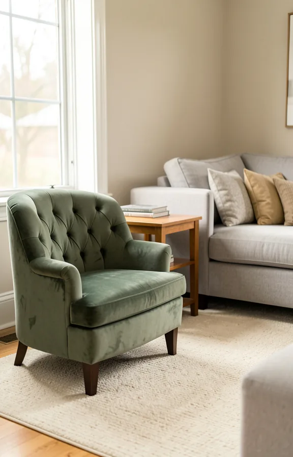
A single velvet accent chair anchors the corner opposite your sofa, creating a second seating zone in a compact layout. Choose deep sage green, charcoal, or warm terracotta velvet paired with a simple wooden frame in natural or walnut finish.
Soft, warm light from a slim floor lamp beside the chair creates an intimate reading nook without competing with your main seating area. The velvet catches light differently than your sofa, adding visual texture and depth to the room.
Layer a chunky knit throw across the armrest and place a small side table within arm’s reach for drinks or books. This arrangement lets both of you have separate spaces while staying in the same room.
Most small apartments need multiple focal points to feel intentional. A single quality accent chair does this work without crowding the floor plan.
Pro Tip: Choose a chair with exposed wooden legs rather than a skirted base. Visible legs create visual lightness and make the room feel larger than it actually is.
18. Sheer Curtain Layering
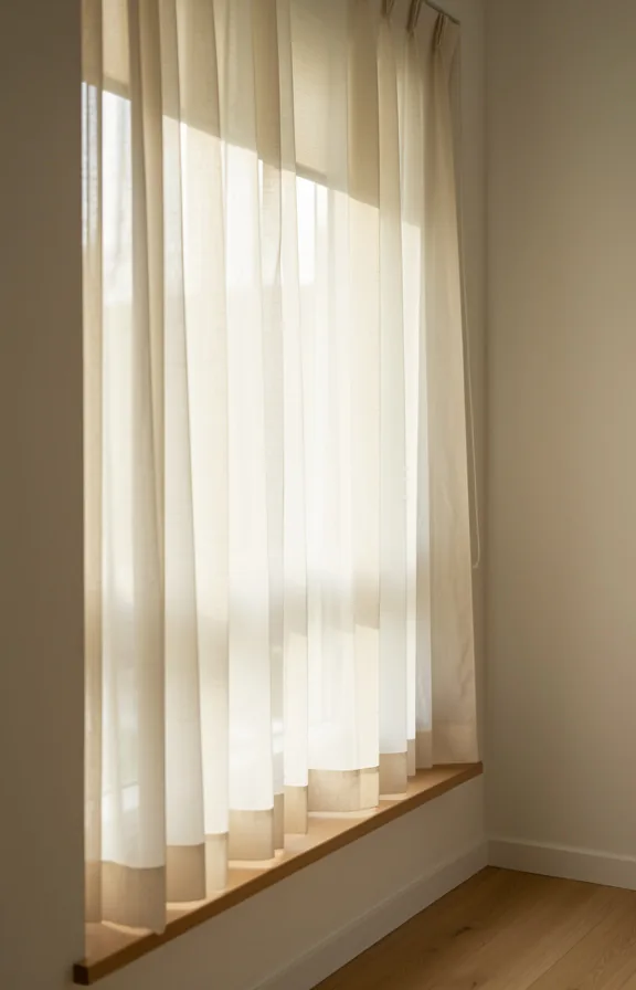
Cream linen sheers hung over a white roller shade create soft, filtered light throughout your space.
The sheer fabric diffuses afternoon sun without blocking your view or making the room feel dark and closed.
This layering gives you privacy control without bulky blackout curtains eating into your square footage.
The pale, natural tones keep walls feeling open and connected, which matters in tight quarters.
Light bounces off the fabric texture, adding depth that a bare window cannot match.
This works best in apartments where you need flexible light control without installing heavy hardware.
Pro Tip: Hang sheers from a slim tension rod or lightweight track to minimize visual weight near your ceiling.
19. Geometric Wall Decals
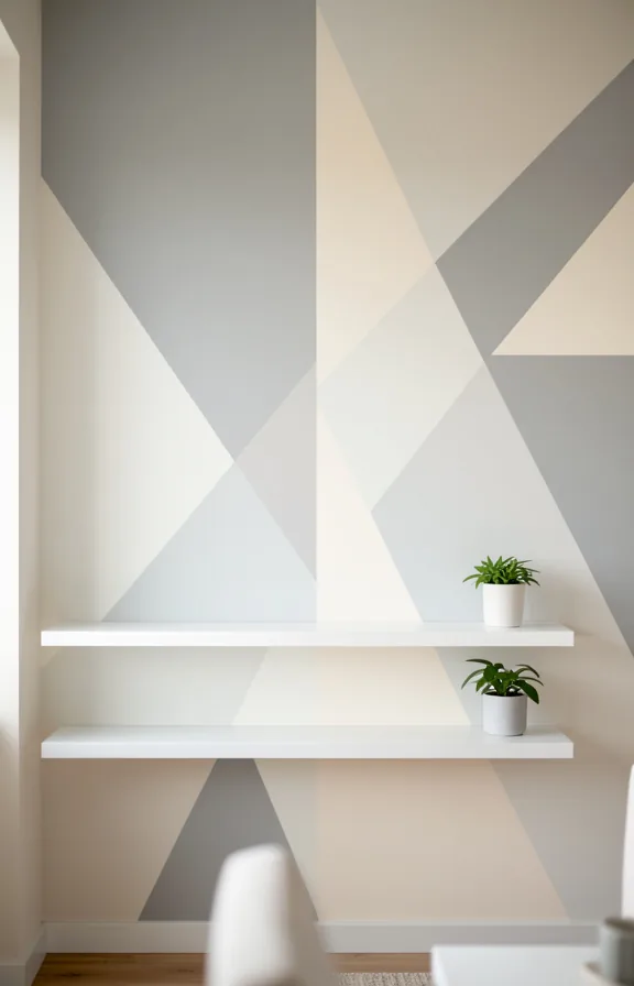
Soft grey and cream geometric shapes float across your accent wall, creating subtle movement without visual chaos. The decals catch light differently depending on the time of day and viewing angle.
This approach works because it adds architectural interest to a blank wall without paint commitment or permanence. You get custom detail that rents allow and future moves forgive.
Pair the decals with warm white walls and minimal furniture to let the pattern breathe. A single floor lamp and low seating below the decals ground the composition.
The colour palette stays neutral, so the geometry itself becomes your room’s focal point. Matte finishes on the decals prevent them from feeling plastic or cheap.
This strategy suits couples who want personality without permanence or major renovation. Most of the impact comes from thoughtful placement and restraint.
Pro Tip: Place decals starting at eye level rather than floor to ceiling. Anchoring them to human scale makes them feel intentional, not like decoration.
20. Vintage Side Table Styling
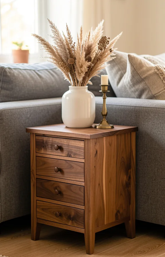
Warm amber tones and layered textures define this approach to small living room styling. A vintage side table becomes the focal point, holding just three or four objects that tell a quiet story together.
Brass candlesticks pair with white ceramic vessels and dried botanical stems in a soft, neutral palette. The wood finish on the table should be warm and medium-toned, not dark or highly polished.
This concept works because restraint reads as intentional, not empty. Your eye lands on each object and notices its shape and texture instead of feeling overwhelmed by clutter.
The lighting quality matters most here. A nearby lamp or window light should graze across the table surface, catching the patina on brass and highlighting the ceramic glaze.
This approach suits couples who prefer calm, collected spaces without fussy styling. Success depends on choosing objects with real visual weight, not filling the surface with tiny decorative items.
Pro Tip: Odd numbers work better than pairs or groups of four. Three objects create visual balance in a way that feels both complete and uncluttered on a small surface.
21. Arched Floor Lamp
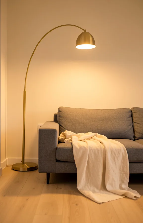
Warm brass curves over a grey sofa create an instant focal point without eating floor space. The arc shape pulls your eye upward, making the room feel taller than it actually is.
Soft, downward-facing light pools across cushions and throws, turning your seating into a lit-from-above retreat. This kind of lighting feels more intimate than overhead fixtures in a shared apartment living room.
Pair it with neutral upholstery and natural wood tables to keep the space feeling open and calm. The metallic warmth anchors the room without visual clutter.
This works well in smaller rooms because the vertical arc adds height while the single footprint takes minimal square footage. Most couples find this lighting setup extends their time on the sofa without needing extra seating.
Pro Tip: Position your arched lamp slightly behind the sofa so light casts across both seating and the wall beyond, not directly into your sightline when sitting.
22. Shared Workspace Integration
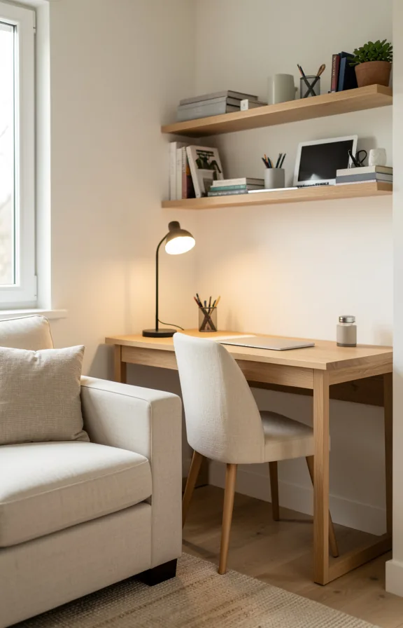
A compact desk anchors one corner of your living room, tucked beside the sofa rather than opposite it. Natural wood or light metal legs keep the piece visually light and open.
Warm white walls surround the workspace, with soft task lighting from a small brass or matte black desk lamp. The palette stays neutral so work items don’t visually compete with your living space.
A low shelf or floating surface behind the desk holds both functional items and a few personal objects. This boundary between work and relaxation stays soft and blurred rather than rigid.
Plants on the desk corner and a woven storage basket beneath add texture without clutter. Your eye reads the setup as part of the room, not as an afterthought squeezed in.
This works best when your sofa faces away from the desk slightly. Most couples find the arrangement works only if you can sit back and not stare at work all evening.
Pro Tip: Position task lighting behind the desk to avoid screen glare and keep ambient room light separate from work light.
Start with the floating shelves idea from number 2. Shelves cost thirty dollars and require only a drill and level.
Once your shelves are up, pair them with the gallery wall concept from number 10 to fill the space above with personal history. This two-step approach gives your living room structure and personality without consuming floor space.
Save this list and return to it as your life together evolves. Small space decorating is about knowing what stays and what goes.